Purpose-Built Store Pages in 2026: How to Create a New Template in Shopify

How to Create a New Template in Shopify

Knowing how to create a new template in Shopify gives a store more control than editing the default product or page layout for every customer. A template lets you create a different arrangement of sections and blocks for a defined group of products, collections, pages, blogs, or blog posts while keeping the rest of the storefront unchanged.

The point is not to make every page unique. It is to give genuinely different shopping or content situations the layout they need. A subscription product may need delivery details near the purchase area, a wholesale collection may need a different introductory section, and a campaign page may need a shorter path to a focused offer.
How to Create a New Template in Shopify

How to Create a New Template in Shopify to Solve Specific Design Exceptions

The first decision in how to create a new template in Shopify is not inside the theme editor. It is deciding what the new layout must accomplish that the default template cannot.

A separate template is useful when a group of pages needs a lasting structural difference. Examples include:

  • A product group with a size guide, ingredient panel, or compatibility information
  • A limited collection that needs an editorial introduction and different merchandising
  • A landing page that supports a specific campaign, audience, or purchase path
  • A blog article type that uses a featured resource, author bio, or related-product section
  • A not-for-sale product layout that shows product history without an active purchase area

Do not create a template simply to change one line of copy or swap one image. Use product data, sections, blocks, or theme settings when those tools solve the need without creating another layout to manage.

Name the Template for Its Job, Not Its Appearance

Good names reduce mistakes when several people work in the store. “Product-special” or “Page-v2” does not tell the team why a template exists. “Product-gift-set,” “Collection-seasonal-edit,” or “Page-wholesale-info” gives future users a clearer signal.

Before building, write a short brief:

Template Decision Example
Resource type Product
Audience or use case Subscription customers
Difference from default Delivery-frequency details, FAQ, and subscription explanation
Pages or products that will use it All refill-plan products
Owner Ecommerce manager
Review point Before the next subscription campaign

This small record keeps a new layout from becoming an unexplained theme artifact six months later. It also makes it easier to decide whether a new template is still necessary after a promotion ends.

Build From the Closest Existing Layout

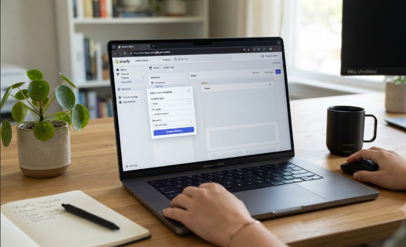
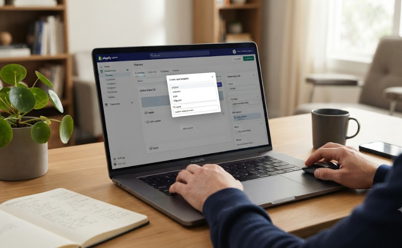
The actual process for how to create a new template in Shopify begins in the theme editor:

  1. Go to Online Store > Themes in Shopify admin.
  2. Find the theme you want to edit and click Edit theme.
  3. Open the Home page drop-down menu, select the relevant template type, and choose Create template.
  4. Enter a unique template name.
  5. In Based on, choose the existing template that is the best starting point.
  6. Select Create template.

Starting from the closest existing layout reduces unnecessary rebuilding. A campaign product template might begin with the default product template, while a wholesale product template might be based on another layout that already has the right purchasing and information structure.

The sections and settings you can use depend on the active theme. Shopify templates are made of sections and blocks, so your new template can be shaped by adding, removing, rearranging, and configuring the components your theme supports.

Change Only What the New Template Needs

The strongest template edits are intentional. Retain the sections that already work, then alter the parts that matter for the new use case.

Using a modular design architecture ensures that reusable sections make your storefront easier to adapt without rebuilding code loops from scratch. Shopify’s layout framework allows you to lock your core product configurations while adjusting the content stack and calls to action for targeted customer segments.

For example, a gift-set product template might place the bundle contents and delivery cutoff near the price, add a gift-message block, and reduce secondary product education. A technical product template may put compatibility data, downloadable specifications, and a contact prompt near the variant selector.

Avoid adding every available section simply because the new template is empty or different. A template should solve a specific problem, not become a second homepage inside a product or collection page.

A coherent Shopify template system can help a growing store keep recurring layouts consistent while giving important product groups the information they need.

Preview With Real Content Before Making an Assignment

Creating a template does not automatically assign it to a product, page, collection, blog, or blog post. In the theme editor, you can preview the template with a compatible resource, which is the safest way to inspect the layout before changing the live assignment.

Check it with an item that has realistic content. A placeholder product may not reveal whether long titles, several variants, many images, product reviews, or large metafield content will disrupt the layout.

When the preview is ready, assign the template in Shopify admin:

Resource Where to Assign the Template
Product Products > selected product > Theme template
Collection Products > Collections > selected collection > Theme template
Page Online Store > Pages > selected page > Theme template
Blog Content > Blog posts > Manage blogs > selected blog > Theme template
Blog post Content > Blog posts > selected post > Theme template

Products and collections can also be assigned in bulk when a whole group needs the same template. Use bulk assignment only after checking one or two representative items first. A template that works for one product may not work for every variant, image set, or product-description length in the group.

Review the Page Like a Shopper, Not a Theme Editor

The key test is not whether the editor saves. It is whether the page helps a real shopper make the next decision.

Open the assigned page on desktop and mobile. Check the first screen, section order, image behavior, purchase actions, product details, app blocks, links, and the path from the page to cart. Look for content that is missing, repeated, poorly spaced, or hidden behind a long stack of sections.

This is especially important for product templates. Confirm that the title, price, variants, availability, key details, add-to-cart control, shipping or return guidance, and any required subscription or bundle logic remain clear.

When a new template requires unique product logic, complex data connections, or functionality that a theme cannot support cleanly, custom Shopify feature development may be more reliable than trying to force the behavior through repeated manual layout edits.

Treat Template Count as a Maintenance Decision

The question of how to create a new template in Shopify should include a second question: will the store still need it six months from now?

Create templates for stable differences, such as a defined product family, recurring campaign format, wholesale channel, or content type. For temporary changes, use existing sections, blocks, metafields, or scheduled content updates where possible.

Maintain a simple list of template names, their purpose, the resource groups assigned to them, and the person responsible for future edits. That makes seasonal cleanup easier and reduces the chance of changing a template that still controls live pages.

Conclusion: How to Create a New Template in Shopify

How to create a new template in Shopify is a matter of defining a real layout need, choosing the correct starting template, making focused section changes, assigning it to the right resources, and testing it with real store content. The goal is not more templates. It is clearer page structures that support specific customer decisions without making the theme difficult to maintain.

For stores that need a durable template strategy rather than a collection of one-off layouts, Zissu Global can shape the theme structure around the way products, content, and customer journeys actually work.


Planning a Shopify Migration in 2026: How Long Does a Shopify Migration Take?

How Long Does a Shopify Migration Take

How long does a Shopify migration take? A small store with a clean catalog, limited design changes, and few integrations can often be prepared in two to four weeks. A growing store that needs data cleanup, a redesign, several apps, and redirect checks commonly needs four to eight weeks. A complex B2B, international, or heavily customized store can need eight to sixteen weeks or more.

These are planning ranges, not fixed delivery promises. The launch date depends less on product count alone and more on the decisions, approvals, dependencies, and testing required before the store can accept real orders safely.

How Long Does a Shopify Migration Take

How Long Does a Shopify Migration Take When Estimating by Scope?

A catalog transfer and a storefront rebuild are very different projects, even when both are described as moving to Shopify. The most useful estimate begins with the actual scope of the move.

Migration Type Practical Planning Range What Is Usually Included
Lean migration 2–4 weeks A clean catalog, a standard theme, essential settings, basic redirects, and a focused launch check
Growth-store migration 4–8 weeks Data cleanup, a tailored storefront, key app replacements, email and analytics setup, redirects, and structured QA
Complex or enterprise migration 8–16+ weeks Custom features, multiple systems, extensive data mapping, international setup, B2B rules, extensive SEO work, and multiple test cycles

A range becomes more accurate once the team knows what must move, what must be rebuilt, which integrations are essential, and who needs to approve the work. A Shopify migration plan helps turn that broad goal into a defined scope with owners, dependencies, and launch criteria.

Data Work Can Be Quick or Become the Main Delay

Imports move quickly when the source catalog is clean. The schedule expands when product records contain duplicate SKUs, inconsistent option names, missing images, incomplete descriptions, or outdated variants.

Review products before import, not after a launch date is already set. Shopify recommends importing products first, followed by customers and then historical orders, so products and customers can be properly connected to past orders.

Before migration, check whether each product has:

  • A clear title and customer-friendly description
  • Accurate prices, compare-at prices, and inventory values
  • Consistent options such as size, color, pack size, or material
  • Correct SKUs and barcodes where relevant
  • Images assigned to the right products or variants
  • Logical collections, tags, and product types
  • An active, draft, or archived status for launch

Migration is an opportunity to remove catalog issues instead of transferring them into a new store.

The Storefront Often Determines the Real Timeline

A merchant using a proven theme with standard sections can usually move faster than a brand building a new storefront from scratch. Custom product logic, subscriptions, bundles, advanced filtering, customer accounts, and unusual merchandising rules all add time because they need to be designed, built, reviewed, and tested.

A project can fall behind when custom requirements appear after the catalog migration is already underway. When a store needs distinctive features or complex shopping flows, Shopify website development should be included in the original scope rather than treated as a late addition.

Design approval follows a similar path. Establishing a clear Shopify website design direction early reduces repeated feedback rounds and prevents mid-project visual changes from delaying development.

The Critical Path Sets the Launch Date

In project planning, the critical path is the sequence of dependent tasks that determines the shortest possible completion time. In a Shopify migration, that path is rarely just uploading a CSV.

It is more likely to look like this:

Finalize catalog decisions → approve design and functionality → configure integrations → test ordering and fulfillment → complete redirect and SEO checks → approve launch

A delay in one linked step can move the entire launch date. Redirects, for example, cannot be finalized until the new URL structure is confirmed. The final URL structure may depend on collection decisions, product handles, and storefront architecture.

That is why the question, “How long does a Shopify migration take?” cannot be answered responsibly with one fixed number before discovery. The project moves at the speed of its unresolved dependencies, not its fastest completed task.

Allow Time for What Teams Usually Underestimate

Several workstreams tend to take longer than expected.

Content and product cleanup. Existing descriptions, images, policy pages, and blog content may need revision or removal before launch.

Third-party integrations. Email, reviews, subscriptions, loyalty, inventory, fulfillment, ERP, CRM, customer support, and tracking tools need to be reconnected, replaced, or rebuilt. Each one requires testing in the new environment.

Traffic protection. Redirect mapping, metadata review, analytics configuration, and campaign-link checks should begin before launch, not on the final afternoon.

Operational testing. Shipping, taxes, payment providers, staff permissions, order notifications, inventory updates, and fulfillment workflows determine whether customers can complete orders successfully.

Performance review. Large media files, unnecessary apps, and unoptimized theme changes can make a new storefront slower than the old one. Shopify speed optimization should be part of pre-launch QA, particularly for image-heavy or app-heavy stores.

Set Milestones Before Choosing the Launch Window

Rather than working backward from an arbitrary launch date, confirm the major milestones first:

  • Scope approved: The team knows what will move, what will be rebuilt, and what will wait until after launch.
  • Data validated: Products, customers, and needed order history are accurate in Shopify.
  • Storefront approved: Key templates, navigation, and mobile layouts are ready.
  • Operations tested: Payments, shipping, taxes, notifications, and fulfillment workflows work correctly.
  • Traffic protected: Domain settings, analytics, redirects, campaign links, and metadata are verified.
  • Launch approved: The final review is complete and the team knows how to handle urgent post-launch fixes.

For teams asking how long does a Shopify migration take, these milestones create a more dependable schedule than choosing a date first and forcing every remaining task into it.

Move Faster by Reducing Uncertainty Early

The safest way to shorten a migration is not to skip testing. It is to make key decisions earlier.

Freeze the first-launch scope, separating essential requirements from improvements that can follow after launch. Choose one decision-maker for approvals, prepare source data before development begins, and give the migration team access to required systems early.

Some workstreams can run in parallel. Design templates can be developed while data is cleaned, and redirect mapping can begin while new collection structures are being finalized. However, avoid building complex functionality before its business rules are approved, because that usually creates rework.

A migration that launches a week earlier but creates broken links, failed order flows, or incorrect tax rules is not actually faster.

Conclusion: How Long Does a Shopify Migration Take?

How long does a Shopify migration take? Expect two to four weeks for a lean, well-prepared store, four to eight weeks for a growing store with meaningful redesign or integration work, and eight to sixteen weeks or longer for complex builds. The right estimate is based on verified scope rather than an arbitrary target date.

Before a Shopify migration goes live, Zissu Global maps the dependencies, implementation work, and quality checks that shape a realistic timeline.

What Is Wix to Shopify Migration in 2026? What Moves, What Changes, and What to Test

What Is Wix to Shopify Migration

What is Wix to Shopify migration? It is the planned move of an ecommerce store from Wix to Shopify, including the selected data, storefront content, operating setup, and customer paths that need to work after launch.

It is not simply copying pages from one website builder to another. A successful move must preserve the information customers need, rebuild the shopping experience around Shopify’s structure, configure operational settings, and protect the traffic already reaching the Wix site.

What Is Wix to Shopify Migration

It Is a Store Move, a Rebuild, and a Launch Plan

At its core, a Wix-to-Shopify move is a form of data migration, but the data transfer is only one part of the work. Products, customer profiles, historical orders, and reviews may be transferred through a suitable method, while the storefront, integrations, navigation, shipping, taxes, payments, and tracking setup need their own review.

The answer to what is Wix to Shopify migration is not “export the old store and import it into Shopify.” The real job is to decide what should move, what needs to be translated into Shopify’s structure, what should be rebuilt, and what should be left behind.

A structured Shopify migration plan helps separate those decisions before the live domain changes. For merchants asking what is Wix to Shopify migration, that distinction prevents a common mistake: treating an import report as proof that the new store is ready to sell.

The Transfer Map: Move, Rebuild, or Verify

Not every element of a Wix store has the same migration path. Some information can be exported and imported. Other parts require manual setup, redesign, or replacement.

Store Element Typical Migration Approach What Needs Review
Products Export, map, and import product data Titles, descriptions, variants, SKUs, pricing, images, inventory, and product status
Customers Export and import customer records Duplicate records, addresses, tags, and marketing permissions
Historical orders Import only when the business needs accessible past records The chosen migration method, reporting needs, and customer-service requirements
Reviews Transfer through a suitable review-app process where available Product matching, review formatting, photos, and display placement
Pages and blog content Copy, rebuild, or migrate selected content Formatting, images, internal links, metadata, and page hierarchy
Store design Rebuild in a Shopify theme or custom storefront Navigation, templates, mobile layouts, product-page structure, and brand styling
Apps and integrations Reconnect, replace, or rebuild Email tools, subscriptions, fulfillment, loyalty, analytics, and custom workflows
SEO and traffic Map and validate before launch URL redirects, metadata, domain connection, analytics, and search visibility

A Wix product export is a useful source file, not a finished Shopify catalog. Shopify uses its own product CSV structure, so the data should be mapped and checked before import rather than uploaded without review.

Wix also documents that its standard product-list export does not currently support digital products. Stores selling downloads, memberships, or other digital offers should define a separate migration plan for those items instead of assuming they will appear correctly in Shopify.

Start With a Clean Catalog, Not a Bulk Upload

Product data affects how shoppers find, compare, and buy items. This is the point to correct inconsistent titles, duplicate SKUs, vague descriptions, missing product images, and unreliable variant data.

Build a clean source-of-truth file before importing. Review whether each product has:

  • A clear title and customer-friendly description
  • Correct prices, compare-at prices, and inventory values
  • Consistent options, such as size, color, pack size, or material
  • Accurate SKUs and barcodes where relevant
  • Images assigned to the correct products or variants
  • Logical collections, tags, and product types
  • A decision on whether the product should be active, draft, or archived at launch

Do not use the migration to copy old catalog problems into a new platform. A smaller, accurate product catalog is more useful than a rushed import that creates confusing variants, missing images, or product pages that need immediate repair.

Rebuild the Storefront for Shopify, Not for Wix

Understanding what is Wix to Shopify migration changes the design conversation. The goal is not to recreate every old page block exactly. The goal is to create a Shopify storefront that gives shoppers a clear path from discovery to product evaluation and checkout.

Review the Wix site page by page. Identify what each page is supposed to accomplish, then decide how Shopify should handle that job. A homepage may need a clearer category route. A collection page may need better filters. A product page may need stronger image order, delivery information, variant selection, or buying guidance.

A Shopify website development project is especially useful when the Wix store relies on custom product logic, unusual bundles, subscription behavior, tailored product finders, or integrations that a standard Shopify theme cannot support cleanly.

This is also the right time to remove old workarounds. A complicated menu, duplicate landing pages, or slow visual effects may have existed because of limitations in the old site. They do not need to become permanent parts of the new one.

Treat Operations as Launch Requirements

A storefront is not ready because the catalog has imported. The operational parts of the business must work before customers arrive.

Review these areas before switching the live domain:

  • Payment provider setup and payout details
  • Shipping zones, rates, local delivery, and pickup rules
  • Tax settings and product tax requirements
  • Fulfillment workflows and warehouse integrations
  • Order-confirmation, shipping, and customer-notification emails
  • Staff accounts and permissions
  • Analytics, advertising pixels, and consent settings
  • Customer support tools and return processes

Run test orders that reflect realistic purchases. Test a standard product, a discounted product, a product with variants, and any special order type that matters to the store. Confirm that payment, inventory, shipping logic, notifications, and fulfillment details work as expected.

The domain decision should also be planned separately from the storefront rebuild. A domain purchased through Wix can be connected to Shopify without transferring ownership of the domain itself. What matters is that the DNS changes are correct and that the domain resolves to the new store at launch.

Protect the Traffic and Search Value You Already Have

A migration can change product handles, collection paths, blog URLs, page architecture, and navigation. Each change can affect customers arriving through bookmarks, Google results, paid campaigns, email links, social posts, or external websites.

Create a redirect map before launch for the URLs that matter most:

  • High-traffic product pages
  • Best-selling or evergreen collections
  • Blog posts with search traffic or backlinks
  • Campaign landing pages
  • Policy, contact, support, and account pages
  • URLs used in current ads, email automations, or partner content

Each old URL should point to the closest useful replacement. A discontinued product may redirect to a relevant alternative or collection, while an old category should lead to the matching new category. Sending every retired page to the homepage creates an unnecessary dead end for customers.

Define “Ready” With a Launch Scorecard

The final decision should be based on a storewide check, not a single successful import.

Launch Area Ready-to-Launch Check
Catalog Products, prices, variants, inventory, and images are correct
Storefront Homepage, collections, product pages, cart, and key mobile screens work properly
Commerce Shipping, payments, taxes, and order notifications pass test orders
Traffic Domain, HTTPS, analytics, redirects, and major campaign links are verified
Performance Images, apps, and templates do not create obvious page-speed issues
Team operations Staff can manage orders, fulfill purchases, support customers, and update content

A migration is also a good time to reduce unnecessary apps, oversized media, and slow theme elements. Shopify speed optimization helps ensure the rebuilt store stays responsive as customers browse products, move between collections, and complete checkout.

Conclusion: What Is Wix to Shopify Migration?

What is Wix to Shopify migration? It is a planned transition that moves the right business data while rebuilding the storefront, operating setup, and customer journey for Shopify. It requires more than an import because the real measure of success is whether the new store can serve customers, process orders, preserve important traffic, and support the business after launch.

Brands moving from Wix can work with Zissu Global to map the migration, rebuild the Shopify store around their operational needs, and launch with the checks needed to protect customer access and search visibility.

How to Design a Good Shopify Website in 2026: A Shopper-First Guide

Learning how to design a good Shopify website is not about adding more sections or choosing the most dramatic visual style. It is about helping a visitor move from “What is this?” to “Is this right for me?” and finally “Am I ready to buy?” with as little uncertainty as possible.

A well-designed store gives each page a clear job. The homepage introduces the offer, collections help people narrow the choices, product pages answer buying questions, and the cart carries that confidence into checkout. When those pieces work together, the store feels easier to use and more trustworthy without needing to look crowded or overdesigned.

How to Design a Good Shopify Website

Design Around the Questions Shoppers Ask First

Before touching a theme setting, list the questions a new visitor is likely to have. The order will vary by product, but most shoppers want to know what the brand sells, who it is for, why the product is worth considering, and where they should explore next.

This is the real starting point for how to design a good Shopify website. A design decision should make one of those questions easier to answer. A new color palette may strengthen recognition, for example, but it cannot compensate for a confusing category structure or a vague product promise.

Write a one-sentence statement that describes the store’s main offer. Then decide what the homepage must show first, what the collection pages must sort, and what the product pages must prove. A thoughtful Shopify brand-design strategy gives that work a visual system instead of treating every section as a separate creative choice.

Build a Route, Not a Collection of Pages

A store becomes easier to shop when its main pages hand visitors to the next useful page. Think of the route as a sequence of decisions rather than a set of isolated layouts.

Page Shopper Question Design Priority Useful Next Action
Homepage What does this store offer? Clear promise and a relevant entry point Browse a category or best-selling range
Collection page Which option fits my needs? Visible categories, filters, and product comparison cues Open a relevant product
Product page Should I buy this item? Proof, detail, variants, and purchase reassurance Add to cart
Cart Is the order correct and worthwhile? Clear order summary, delivery context, and uncomplicated checkout route Continue to checkout

For merchants deciding how to design a good Shopify website, this route prevents a common problem: a polished homepage that does not lead anywhere useful. Each page should make the next choice simpler, not restart the customer’s research.

Let the Homepage Direct Traffic Instead of Trying to Say Everything

The homepage should orient a first-time visitor, not contain every promotion, product category, customer review, and brand story at the same visual level.

Start with one strong opening message. It should tell visitors what you sell or the outcome they can expect, supported by imagery that makes the offer immediately recognizable. Follow it with one primary call to action, such as a best-selling collection, a shopper-friendly category, or a product finder.

Then decide what deserves a place farther down the page. Useful supporting blocks often include customer proof, a short explanation of what makes the products different, a small selection of categories, or a practical buying guide. Remove blocks that repeat the same point or compete with the primary action.

Good homepage design keeps cognitive load manageable. When too many competing messages, buttons, or visual styles demand attention at once, visitors have to work harder to decide where to look.

Make Collections Feel Like Helpful Shortcuts

A collection page should help customers scan products and rule out the wrong options quickly. It is where a broad interest turns into a smaller, more confident choice.

Use collection names that match the way customers shop. A skincare brand may guide visitors by concern, while a homeware store may use room, material, or product type. Labels such as “Solutions” or “Explore” can sound polished but often force visitors to guess what they will find.

Filters should support genuine buying decisions, not simply display every product attribute available in your catalog. Size, color, price, compatibility, material, and use case can be helpful. Too many irrelevant filters can make a smaller catalog feel harder to browse.

Add short collection copy only when it clarifies the category, makes a product distinction, or answers a common question. The page should still get visitors to product listings quickly.

Put the Most Important Evidence Near the Buying Decision

Knowing how to design a good Shopify website means treating product pages as decision pages, not just product displays. The product page needs to remove the hesitation that remains after a shopper has found an item they like.

Place core buying information where it can be understood without unnecessary scrolling: product name, price, variants, availability, main benefits, and a clear add-to-cart action. Then add the details that are specific to the item, such as fit, dimensions, ingredient information, material, care instructions, compatibility, delivery expectations, or return guidance.

Images should answer questions as well as create interest. Show scale, texture, use, fit, or important product details when those elements affect the purchase. Reviews, guarantees, and concise FAQs can add reassurance when they address realistic concerns rather than filling the page with generic claims.

When a product needs functionality that a standard theme cannot support cleanly, such as complex variant logic, comparison tools, or tailored bundle behavior, Shopify website development can turn those requirements into a more manageable storefront experience.

Treat Mobile as the Place Where the Design Proves Itself

A desktop mock-up can make nearly any layout look calm and spacious. The phone view reveals whether the experience still works when shoppers have less screen space, less patience, and less room for competing elements.

Review the store on a phone from the first screen through checkout. Check the navigation, collection filters, image galleries, variant selectors, add-to-cart area, cart, and every key button. Make sure text is readable, actions are easy to tap, and priority information does not disappear below oversized images or decorative sections.

Visual decisions also affect performance. Large image files, overlapping apps, video backgrounds, and unnecessary animations can make an otherwise thoughtful store feel slow. Shopify speed optimization is especially relevant when design relies heavily on product media or interactive features.

How to Design a Good Shopify Website

Review the Store Without Using Your Own Product Knowledge

Teams who work on a store every day often know where everything is. A first-time visitor does not. Test the customer journey with a task that a real shopper might have.

Try finding a particular product from the homepage. Compare two suitable options. Check whether the product page answers the questions that would stop you from buying. Add an item to the cart, look for shipping or returns information, and continue toward checkout.

This test makes it easier to see gaps between attractive design and usable design. A Shopify CRO review can also help a merchant prioritize which obstacles are most likely to affect product discovery, cart progression, and purchase completion.

Conclusion: How to Design a Good Shopify Website

How to design a good Shopify website comes down to making the next decision clear at every stage of the journey. Start with the shopper’s questions, give each page one clear role, make product evaluation easier, and test the mobile path before considering the design complete.

The most effective storefronts are not the ones with the most visual elements. They are the ones that help customers understand the offer, find a suitable product, and buy with confidence. For merchants planning that kind of storefront, Zissu Global brings Shopify design, development, performance, and conversion thinking into one focused experience.

How to Design a Newsletter Using Shopify Email: 7 Steps for a Clearer Campaign

How to Design a Newsletter Using Shopify Email

Learning how to design a newsletter using Shopify Email is less about filling a template with promotions and more about giving one group of subscribers a clear next step. A well-designed email makes the offer easy to notice, explains why it matters, and takes the reader to the most relevant page in your store.

Shopify now provides its email tools through Shopify Messaging, formerly Shopify Email. For most merchants, the strongest newsletter is simple: one main message, recognizable brand styling, a mobile-friendly layout, and one primary call to action.

How to Design a Newsletter Using Shopify Email

1. Decide What This Specific Newsletter Must Accomplish

Before choosing a template, write one sentence that states the newsletter’s job. It might introduce a collection, announce a restock, support a launch, invite customers to read a guide, or give past buyers a reason to return.

A newsletter with several equal messages asks the reader to decide what matters. A focused newsletter removes that work. Choose one primary action, then make every element of the email support it.

When you are considering how to design a newsletter using Shopify Email, begin with three decisions:

  • Who is receiving it?
  • What is the one thing they should understand?
  • Where should they click next?

For example, a summer collection announcement for customers who previously purchased related products can feature one hero image, a short value-focused message, and a button leading to the collection page. It does not need multiple discounts, a brand story, and several categories competing for attention.

2. Give the Reader a Clear Route Through the Email

A newsletter should have an obvious reading order. Visual hierarchy helps the eye move from the most important message to the supporting details, then to the action you want the subscriber to take.

For a standard promotional email, use this five-block sequence:

  1. Recognition: A logo or unmistakable brand identifier.
  2. Lead: A short headline and one dominant image or product visual.
  3. Reason: Two or three lines explaining the product, offer, or benefit.
  4. Action: One prominent button with an accurate destination.
  5. Support: A small amount of secondary information, such as a deadline, product detail, or reassurance.

This order matters more than visual effects. A subscriber should understand the campaign quickly even when they scan only the top half of the email. That structure is a practical starting point for designing a newsletter using Shopify Email without turning a simple campaign into a crowded promotion.

Keep the headline specific. “New arrivals are here” is usable but vague. “Lightweight layers for humid-weather weekends” gives the reader a clearer reason to continue. The button should complete the sentence logically, such as “Shop the collection,” “See the new colors,” or “Build your routine.”

3. Match the Layout to the Type of Send

Not every newsletter needs the same ratio of copy, imagery, and products. A new-product announcement needs a different layout from an educational update or a repeat-purchase reminder.

Newsletter Purpose Design Emphasis Main Destination
New collection or launch One strong visual, concise headline, collection-level CTA Collection page
Restock notice Product image, availability detail, direct CTA Product page
Educational send Readable copy, helpful imagery, softer CTA Blog post, guide, or category
Seasonal promotion Clear offer, product relevance, visible deadline Campaign landing page or collection
Repeat-purchase reminder Product familiarity, timing, and convenience Reorder path or product page

Let the objective determine the layout, not the other way around. Reusing a launch template for every campaign makes the newsletter feel routine and can bury the point of the message.

4. Build It in Shopify Messaging Without Overbuilding It

In Shopify’s current workflow, go to Apps > Messaging, choose Create campaign, select an email template, and then choose the subscriber group or customer segment for the send. Add the subject line, preview text, campaign content, and delivery timing before scheduling or sending.

For merchants learning how to design a newsletter using Shopify Email, the editor should be treated as a publishing tool, not a place to make every design decision from scratch. Decide the email’s structure and copy first, then use only the blocks that serve the campaign.

A reliable build sequence is:

  1. Select the recipient group.
  2. Choose the closest suitable template, not the most decorative one.
  3. Add the headline, lead image, concise copy, and one primary button.
  4. Check that buttons and product cards point to the exact destination.
  5. Preview the email on desktop and mobile before sending.

Avoid adding a section only because the template includes one. Empty space can make an offer easier to understand.

5. Make the Email Feel Like an Extension of the Store

Subscribers should recognize the sender before reading every line. Use the core colors, type choices, image direction, and voice that appear on the storefront. This helps the product page feel like a natural continuation of the email.

A well-defined Shopify website design system gives your team clearer rules to reuse across the storefront and email program. The goal is not to copy every page element into an inbox. It is to carry the cues that make the experience feel coherent.

Use one or two type styles rather than several decorative fonts. Reserve high-contrast color for the primary action. Avoid placing essential text inside images, and leave enough space around copy and buttons for easy reading and tapping.

6. Treat Mobile as the Main Design Review

Most subscribers will open the newsletter in a narrow email client window or on a phone. Check whether the headline still works without the supporting paragraph, whether the button remains visible without excessive scrolling, and whether product images still make sense at a smaller size.

A mobile-focused newsletter also limits competing links. A header menu, several product cards, social icons, and multiple buttons can send readers in too many directions. Keep the primary call to action visually distinct, then add secondary links only where they genuinely help.

Test the email as a shopper would. Open the campaign on a phone, tap the button, and inspect the page that opens. The experience should feel continuous from inbox to storefront.

7. Check the Click Path Before You Schedule

Good newsletter design continues after the inbox. The page behind the button should deliver exactly what the email promised.

Before scheduling, check the subject line and preview text, image crop, button copy, link destination, product availability, price, variants, and any offer timing. When the newsletter is intended to drive sales, the destination page matters as much as the email layout. Shopify CRO consulting can help merchants examine whether the route from email click to product discovery, cart, and checkout creates unnecessary friction.

After sending, review which links earned attention and whether readers reached the page you expected. Change one meaningful element in the next comparable campaign, such as the headline, lead image, CTA, or copy length. This makes future newsletter decisions more deliberate.

How to Design a Newsletter Using Shopify Email

Conclusion: How to Design a Newsletter Using Shopify Email

The best answer to how to design a newsletter using Shopify Email is to begin with a focused campaign goal, then build a clear reading path with relevant imagery, restrained brand styling, and one primary action. Shopify’s email tools can help you assemble and send the campaign, but the strategy behind the email determines whether a subscriber understands what to do next.

For merchants who want their email campaigns and storefront experience to work together more effectively, Zissu Global combines Shopify design and conversion thinking to create clearer paths from campaign click to purchase.

How to Test URL Redirects After Shopify Migration in 2026: A Post-Launch QA Workflow

How to Test URL Redirects After Shopify Migration

Knowing how to test URL redirects after Shopify migration is not simply checking whether an old link opens a new page. It is a post-launch quality check that confirms customers, search engines, paid campaigns, bookmarks, and external links all reach the right place after your store structure changes.

A successful redirect test asks three questions: Does the old URL redirect? Does it land on the correct replacement page? Can a shopper continue their journey without confusion? A redirect that technically works but sends a customer from a specific product to an unrelated collection or the homepage can still create lost sales and a poor user experience.

How to Test URL Redirects After Shopify Migration

How to Test URL Redirects After Shopify Migration Using a Redirect Map

Before testing, prepare a simple list of the URLs that matter most. Do not rely only on a list of redirects exported from Shopify. You also need the old URLs that customers and search engines were actually using before the migration.

Prioritize URLs from:

  • High-traffic product pages
  • Best-selling product pages
  • Important collections and category pages
  • Blog posts with organic traffic or backlinks
  • Landing pages used in email, paid ads, affiliates, or social campaigns
  • Policy, contact, account, and help pages
  • URLs shared in printed materials or customer support templates

For each old URL, record the expected destination. The expected page should be the closest useful replacement, not simply the nearest page you can find.

When teams ask how to test URL redirects after Shopify migration, the most reliable answer is to begin with this map. It prevents a common launch mistake: checking only a few obvious pages while missing the URLs that carry the most customer intent or search value.

A structured Shopify migration plan should include URL mapping before launch, especially when product handles, collection structures, blog paths, or information architecture are changing.

How to Test URL Redirects After Shopify Migration

Check Whether the Old URL Can Actually Redirect

In Shopify, a redirect does not override an active page. If the old path still belongs to a visible product, collection, page, or other live resource, Shopify can continue serving that content instead of sending visitors to the new destination.

Review each source URL before assuming that the redirect setup is correct:

Check What to Confirm
Old source path The original URL is copied exactly, including the relevant path
Source availability The old path is no longer serving active content
Target path The destination page is live, relevant, and ready for visitors
Redirect entry The source and destination are correctly listed in Shopify’s URL Redirects area
Priority level Important URLs are marked for individual testing after launch

Shopify lets merchants manage redirects under Content > Menus > View URL Redirects. You can create individual entries, edit them in bulk, or import a prepared CSV when the migration includes a large number of URLs.

Do not wait until weeks after launch to discover that old pages were still active or that a redirect was never imported. Resolve those conflicts before they affect customers and search visibility.

Test the Destination, Not Just the Redirect

A redirect is only useful when it sends the visitor to the right place. For example, an old product page should usually lead to the matching product, a close replacement, or the most relevant collection. An old category should lead to the matching new category, not a generic homepage.

A 301 redirect is commonly used for a permanent URL move. But from a merchant’s perspective, the more important test is whether the customer lands on a page that fulfills the same need as the original one.

Use this practical standard:

  • Good match: Old “women’s linen shirts” category goes to the new linen-shirt collection.
  • Acceptable match: A discontinued product goes to a closely related replacement or a relevant category.
  • Weak match: A specific product redirects to a broad homepage with no clear next action.
  • Failure: The old URL loads a 404 page, loops back to itself, or lands on an unrelated page.

Avoid using the homepage as a default destination for every retired URL. It can be appropriate in limited cases, but only when it genuinely gives the visitor a useful route forward.

Run Individual Browser Tests First

After the Shopify domain is live, open a private or incognito browser window and paste each priority old URL directly into the address bar. Do not search for the page through Google first, because search results can show the new destination rather than reveal the redirect behavior of the old URL.

For every priority URL, confirm:

  1. The old URL changes to the intended destination.
  2. The destination page loads fully.
  3. The page is relevant to the original visitor intent.
  4. The primary next action is visible and usable.
  5. The page works on mobile as well as desktop.

Use a browser session without cached data when possible. Shopify notes that browser cache can affect what you see during redirect troubleshooting, so repeat a failed test in another browser or on another device before assuming the redirect entry is broken.

This individual test is especially important for top-selling products, evergreen blog articles, campaign landing pages, and high-value collection pages.

Use a Spreadsheet to Test the Full Redirect List

For a larger site, individual browser checks alone are not enough. Use a spreadsheet or redirect-crawling tool to review the complete list in batches.

A practical test sheet includes:

Old URL Expected Destination Actual Destination Result Action Needed
/products/old-handle Relevant replacement product Pending test Pass / fail Correct mapping if needed
/collections/old-category New category page Pending test Pass / fail Review collection target
/blogs/news/old-article Updated article or closest topic page Pending test Pass / fail Confirm relevance

This makes how to test URL redirects after Shopify migration a controlled verification process rather than a vague launch task. It also gives your team a record of what was checked, what failed, and what still needs attention.

Look for redirect chains during batch testing. A chain happens when one old URL redirects to another URL that redirects again before reaching the final page. Even when the final page is correct, unnecessary steps can slow the visit and make future maintenance harder.

Include Real-World URL Variations in the QA Check

Customers do not always visit your cleanest URL. They may use an old campaign link, a bookmarked product variant, a link from a social post, or a URL copied from an email.

Add examples such as these to the test list when they exist:

  • URLs with tracking parameters from paid campaigns
  • Product URLs with variant parameters
  • Old blog-post URLs shared in newsletters
  • Links with trailing slashes
  • URLs entered with uppercase characters
  • Links from previous international or regional paths
  • Old domain versions that may still appear in third-party profiles

You do not need to create redirects for every imagined variation. Test the versions that were actually used in campaigns, shared externally, or present in your old site data.

When the new Shopify structure requires more than standard redirect mapping, such as complex product logic, custom URL behavior, or a major navigation rebuild, Shopify website development may be a better long-term solution than adding layers of temporary workarounds.

Keep Monitoring After Launch

Redirect testing does not end on launch day. In the first few weeks, monitor customer support questions, paid-campaign landing pages, traffic to retired URLs, and any not-found issues that appear in your analytics or search tools.

Shopify automatically generates a sitemap for products, collections, pages, and blog posts. After migration, make sure the live sitemap reflects the pages you expect search engines to find and that the store is accessible for crawling.

Treat every recurring 404 or misdirected high-intent URL as a repair task. The sooner you correct it, the less likely it is that a customer, campaign, or valuable external link will send visitors to a dead end.

Conclusion: How to Test URL Redirects After Shopify Migration

How to test URL redirects after Shopify migration comes down to verifying the full customer route, not only the redirect setting. Build a prioritized URL map, confirm that each old source can redirect, test the final destination in a clean browser session, and review large redirect lists in a structured spreadsheet.

The goal is simple: every important old URL should guide visitors to the most relevant new page without dead ends, detours, or confusion.

For brands handling a high-stakes Shopify transition, Zissu Global brings migration planning, technical implementation, and post-launch quality checks into one focused process.

How to Keep SEO Ranking During Shopify Migration: Protect Organic Traffic Before, During, and After Launch

Knowing how to keep SEO ranking during Shopify migration requires protecting the specific pages, links, and search signals your existing store has already earned. The technical transition is not finished when your product catalog appears in Shopify; it is finished when customers and search engine crawlers can navigate your new URL structure without encountering broken paths.

A migration cannot guarantee that every keyword position will remain unchanged from one day to the next. What it can do is reduce avoidable losses by preserving high-value content, mapping changed URLs carefully, and checking the new store before and after the domain switches.

How to Keep SEO Ranking During Shopify Migration

How to Keep SEO Ranking During Shopify Migration by Auditing High-Value Pages

Before changing the store, identify the pages that currently matter most in organic search. Do not begin with a generic export of every URL. Start with the pages that earn clicks, impressions, backlinks, conversions, or brand visibility.

Use your analytics and Search Console data to create a working inventory of important product pages, collections, blog posts, guides, and landing pages. Include the current URL, primary topic, traffic level, conversions where available, and the intended Shopify destination.

Page Type What to Capture Before Migration Why It Matters
Product pages URL, product name, traffic, sales, backlinks High-intent visitors may be ready to purchase
Collection pages URL, category purpose, search terms, traffic These often support category-level discovery
Blog posts and guides URL, topic, linked products, organic visits Useful content can attract visitors long after publication
Campaign pages URL, active ads, email links, partner links Existing traffic should not land on a dead page
Support and policy pages URL, purpose, customer usage These pages affect trust and customer service

The practical answer to how to keep SEO ranking during Shopify migration starts with knowing what must be protected. Without that baseline, teams can rebuild the storefront successfully while accidentally retiring pages that still bring qualified visitors.

Match Search Intent Before Mapping Old URLs

A redirect map should be based on the purpose of the original page, not just on which new page is easiest to select. The best destination is usually the closest page that helps the visitor complete the same task.

Old Page Strong Destination Weak Destination
Discontinued product Closest replacement product or relevant collection Homepage
Old category page Equivalent Shopify collection Broad “Shop All” page with no category context
Evergreen buying guide Updated guide or closest educational article Unrelated blog archive
Campaign landing page Matching active campaign or category page Generic contact page

When deciding how to keep SEO ranking during Shopify migration, avoid redirecting every retired page to the homepage. A visitor who searched for a specific product, category, or guide should reach a useful next step, not be asked to start their research again.

A detailed Shopify migration plan helps organize this work before the live switch, especially when collection structures, product handles, blog paths, or navigation are changing.

Rebuild Search Signals, Not Just Page Layouts

A Shopify store should preserve the usefulness of the old site while improving the customer experience. Recreate the important content elements that explain each page’s purpose: accurate page titles, headings, product information, collection copy, image context, internal links, and metadata.

Do not automatically copy every old sentence into Shopify. Remove outdated material, fix thin descriptions, and improve confusing content where needed. The key is to keep the topic and value of pages that already serve a real search need.

This also means reviewing each page’s canonical URL. A canonical URL signals the preferred version of a page when similar or duplicate versions may exist. During a migration, check that the intended live page is the version being presented consistently through navigation, internal links, and technical setup.

For stores that need custom templates, complex merchandising rules, advanced filtering, or non-standard product behavior, Shopify website development can help prevent technical shortcuts from creating a confusing or fragmented search experience.

Make the New Store Easy for Search Engines to Discover

Once the Shopify storefront is ready, make sure search engines can reach and understand the new pages. A successful handover includes more than redirect entries.

Check that the intended primary domain is live, pages are accessible without password protection, and important content is not accidentally hidden from search. Shopify automatically generates a sitemap for store products, collections, pages, and blog posts, which can be submitted through Search Console after launch.

Knowing how to keep SEO ranking during Shopify migration also means making it easy for search engines to recognize the new site structure. Confirm that key pages appear in the sitemap, navigation points to the intended URLs, and internal links do not lead back to retired paths.

For international stores, review market-specific URLs, languages, and regional pages carefully. A migration can create avoidable problems when the primary market works correctly but translated or localized paths are missing, redirected poorly, or left disconnected from the new structure.

Treat Redirect Testing as a Search-Visibility Check

Redirects should be tested as customer journeys, not just technical entries in a list. Open important old URLs directly in a clean browser session and confirm that each one reaches the expected new page.

Prioritize testing for:

  • High-traffic product and collection pages
  • Pages with strong backlinks
  • Long-running blog content
  • URLs used in paid ads, email campaigns, and social posts
  • Pages that previously generated sales or lead activity
  • Important international or regional paths

Look for three common issues: a redirect leading to an irrelevant destination, a redirect chain that adds unnecessary steps, and a 404 page where a useful destination should exist. Correcting these early protects customers as well as search visibility.

Google’s site-move guidance emphasizes using permanent redirects for permanently moved URLs and monitoring the new site after launch. Shopify’s redirect tools can help manage individual redirects or larger lists through CSV import and export.

Watch the Migration Window Instead of Judging Day One

Search engines need time to revisit changed URLs, process redirects, and update their understanding of the site. Do not decide that a migration failed because rankings move during the first few days.

Monitor the store through a defined post-launch period. Review Search Console for indexing issues, sitemap processing, crawl errors, and the performance of priority pages. Compare organic traffic and conversions against the pre-launch baseline, while allowing for normal seasonality and campaign changes.

Pay particular attention to pages that previously generated meaningful traffic. If a key collection page loses visibility, check whether its redirect target is relevant, whether its content remains useful, and whether the new page is accessible through the site’s internal navigation.

Page quality also matters after the technical handover. Large images, unnecessary apps, and unstable theme elements can make the new store slower or harder to use. Shopify speed optimization can support a smoother migration by keeping important landing pages responsive as the new storefront takes shape.

Avoid Changing Every SEO Variable at Once

A migration already changes a major part of the site environment. Adding a complete content rewrite, new domain, new navigation model, new product taxonomy, and major design overhaul at the same time makes it difficult to identify what caused a problem.

Where possible, preserve the core purpose of high-performing pages during the initial launch. Major content experiments, category changes, and promotional redesigns can follow after the new store is stable and the migration data has been reviewed.

This does not mean copying an outdated website forever. It means sequencing the work intelligently: protect proven assets first, then improve them with evidence from the new Shopify store.

Conclusion: How to Keep SEO Ranking During Shopify Migration

How to keep SEO ranking during Shopify migration comes down to preserving search intent, maintaining useful URL paths, rebuilding important page signals, and monitoring the store after launch. Strong redirects matter, but so do relevant destinations, clear internal links, accessible pages, and a reliable post-launch review.

For a migration that protects the traffic your business has already earned, Zissu Global can help coordinate the technical handover, storefront rebuild, and search-visibility checks before the new Shopify site goes live.

What Is the Best Design Tool for Shopify Stores? 3 Options Compared

What Is the Best Design Tool for Shopify Stores

What is the best design tool for Shopify stores? For most merchants, the best starting point is Shopify’s built-in Theme Editor. It lets you adjust the sections, settings, and templates your current theme makes available, including content layout, colors, typography, and selected product-page elements.

The right tool depends on the work you need to do. A page builder may be useful for a campaign landing page, while Figma is better for planning a custom storefront before development starts. The best option is the one that gives your team enough control without making the store slow, inconsistent, or difficult to maintain.

What Is the Best Design Tool for Shopify Stores

What Is the Best Design Tool for Shopify Stores for Most Merchants?

For everyday storefront updates, Shopify Theme Editor is usually the best design tool for Shopify stores. It works directly with your active theme, which helps maintain a consistent visual style across your homepage, product pages, collection pages, and standard content pages.

What Is the Best Design Tool for Shopify Stores

Many current Shopify themes use reusable sections, blocks, and templates. This makes it possible to make meaningful design updates without changing theme code or relying on multiple third-party apps.

Use Shopify Theme Editor when you need to:

  • Update homepage banners, image sections, product highlights, and calls to action
  • Rearrange sections to improve page flow
  • Adjust colors, typography, buttons, and spacing
  • Edit available product, collection, blog, or standard-page templates
  • Check desktop and mobile layouts before publishing
  • Keep your storefront design aligned with the rest of the theme

Shopify’s Theme Editor lets merchants customize available theme settings and manage content through sections and blocks. However, the exact controls available depend on the theme you use.

For many stores, learning the full capability of the existing theme is more valuable than adding another design app immediately.

Use a Shopify Page Builder for Campaign-Specific Layouts

A page builder is not automatically the best design tool for Shopify stores. It is most useful when you need a page structure that your theme cannot create cleanly.

For example, a page builder may be worth considering for:

  • Product-launch landing pages
  • Seasonal promotion pages
  • Bundle or gift-guide pages
  • Long-form product education pages
  • Comparison pages
  • Paid-ad campaign landing pages
  • One-product sales funnels

A page builder can provide more layout flexibility than a standard Shopify template. It may let you add custom visual sections, testimonials, comparison tables, offer banners, product bundles, and campaign-specific calls to action without requiring a complete custom build.

However, use page builders carefully. A separate page should still look and feel like part of your Shopify store. Match the site’s typography, button styles, image treatment, and spacing so customers do not feel that they have landed on a disconnected microsite.

Before choosing a page builder, test whether it can deliver:

Requirement Why It Matters
Mobile editing controls Most shoppers will review the page from a phone
Fast page loading Heavy design elements can reduce usability and conversion potential
Theme consistency The campaign should still look like part of the same brand
App compatibility Product reviews, subscriptions, bundles, and other apps should work correctly
Easy maintenance Your team should be able to update or remove the page later

Use Figma When You Are Planning a Custom Shopify Store

Figma is often the best design tool for Shopify stores when the project is larger than a few storefront edits. It is best used before development, when your team needs to review the proposed shopping experience and agree on the visual direction.

Before development, a Figma design can start with a wireframe that helps your team agree on:

  • Homepage structure and promotional hierarchy
  • Navigation and mega-menu behavior
  • Product-page layout and product-information priority
  • Collection filters and merchandising rules
  • Mobile shopping flow
  • Cart presentation and upsell placement
  • Typography, colors, buttons, spacing, and image direction

Figma does not replace Shopify. It gives your team a place to make design decisions before those decisions affect the live store.

For a custom redesign, the strongest process is usually:

  1. Plan the customer journey and page hierarchy.
  2. Create and approve the design direction in Figma.
  3. Confirm what can be handled by the existing Shopify theme.
  4. Develop the necessary custom features.
  5. Test the live storefront across mobile, desktop, and key conversion paths.

This approach avoids making major brand decisions inside a live theme editor.

Choose the Tool Based on the Work, Not the Trend

If you are still asking what is the best design tool for Shopify stores, use the scope of the change as your filter. The best option is not always the newest app or the most flexible builder.

When You Need Better Everyday Store Design

Use Shopify Theme Editor first. Review your homepage, collection pages, product pages, navigation, and cart experience. Look for friction that makes it harder for customers to understand products, compare options, trust the store, or move toward checkout.

Often, a clearer product-information order, stronger call to action, improved collection structure, or more effective homepage hierarchy matters more than a complete visual rebuild.

When You Need a High-Converting Campaign Page

Use a page builder when the campaign requires a custom story that your theme cannot support well. Keep the page focused on one customer group, one offer, and one action you want visitors to take.

Avoid using a page builder only because the standard product template feels limited. First check whether a revised theme template or a custom section could solve the issue with less complexity.

When You Need a New Brand Experience

Use Figma and custom Shopify development when the whole storefront needs to change. This is the right route when your current theme cannot support the desired navigation, product-page architecture, content modules, or branded customer journey.

A successful Shopify website designproject connects your visual branding with fast loading times, clear merchandising, and clean mobile shopping loops, instead of treating design as decoration.

Avoid Adding Too Many Design Tools

The best design tool for Shopify stores is rarely a stack of overlapping apps. Multiple design tools can create inconsistent styling, conflicting settings, duplicated scripts, slower pages, and a storefront that only one person knows how to edit.

Before installing a new tool, ask:

  1. Can the current theme already support this change?
  2. Does the change affect one campaign or the entire storefront?
  3. Will the new tool keep the mobile experience clean?
  4. Who will maintain the page after launch?
  5. Can the page be removed later without disrupting other store elements?

These questions help prevent a temporary campaign solution from becoming a long-term maintenance problem.

Design Tools Still Need Conversion Strategy

A design tool cannot fix a confusing offer, weak product copy, poor navigation, unclear shipping information, or a difficult checkout path. Design should make it easier for shoppers to understand the product, trust the store, and take the next step.

When a store redesign aims to grow revenue, you need to review the buyer journey alongside the visuals. Running a practical Shopify CRO consulting audit helps pinpoint whether your visitors are dropping off due to confusing layouts, hidden product details, mobile layout friction, or cart leaks.

Conclusion: What Is the Best Design Tool for Shopify Stores?

What is the best design tool for Shopify stores? Shopify Theme Editor is the best default choice for most storefront updates because it works within your active theme and supports consistent, manageable changes. Use a page builder for genuinely unique campaign pages, and use Figma when you need to plan a custom Shopify experience before development begins.

The best tool is the simplest one that helps your team create a clear, fast, consistent shopping experience. For merchants planning a major storefront update, Zissu Global helps turn design decisions into reliable workflows and conversion-focused Shopify stores that make it easy for customers to buy.

Which CRO Tools Are Best for Shopify? 7 Tools to Use in 2026

Which CRO Tools Are Best for Shopify

Which CRO tools are best for Shopify? There is no single app that improves every store. The right CRO tools help you identify where shoppers drop off, understand why they hesitate, test a focused improvement, and strengthen the part of the buying journey that is costing you sales.

For most merchants, the best starting stack is not seven new apps. Start with Shopify Analytics to find the largest conversion gap, add a behavior-analysis tool to investigate it, then use a testing tool only when you have a clear change to validate. Add specialist tools only when they solve a proven problem, such as weak product discovery, limited trust, low cart value, or poor repeat-purchase follow-up.

Which CRO Tools Are Best for Shopify

The Answer to Which CRO Tools Are Best for Shopify Starts With the Bottleneck

The table below is a practical way to choose the right tool based on the problem in front of you.

CRO Tool Best For Use It When Do Not Expect It to Fix
Shopify Analytics Finding the largest conversion drop You need a baseline before changing the store Weak product messaging or unclear page design by itself
Lucky Orange Watching real shopper behavior You know where visitors leave but not why A decision based on one unusual visitor session
Visually Testing page, offer, and design changes You have a specific hypothesis to validate A vague “make it convert better” request
Shopify Search & Discovery Improving browsing, filters, and search Customers struggle to find suitable products A product page with weak proof or unclear value
Judge.me Adding product-specific trust Shoppers need reviews, photos, or credible purchase reassurance Poor images, missing product details, or slow delivery
Rebuy Improving cart, upsell, and post-purchase offers Product relationships are clear and relevant A broad catalog with no thoughtful recommendation logic
Klaviyo Recovering interest and encouraging repeat purchases You need segmented email and message flows A weak product page or broken checkout experience

For merchants asking which CRO tools are best for Shopify, the useful question is not “Which app is most popular?” It is “What evidence do I need before I change this part of the store?”

A focused Shopify CRO consulting process can help turn store data, shopper behavior, and conversion obstacles into a prioritized testing roadmap rather than an unplanned app stack.

Which CRO Tools Are Best for Shopify

Shopify Analytics: Find the First Meaningful Drop-Off

Shopify Analytics is a sensible first stop for most merchants because it is already connected to the store. The reports available can vary by Shopify subscription plan, but merchants can use the available analytics to identify where shoppers stop progressing.

A low add-to-cart rate may point to a product-page issue. A healthy add-to-cart rate but poor checkout completion may suggest a pricing, shipping, payment, or checkout-confidence problem. A weak conversion rate from one traffic source can mean that the campaign promise does not match the page shoppers land on.

Do not start by changing button colors or adding a popup. First identify the page or stage where the problem appears most consistently. That gives you a defined question for the next tool.

Lucky Orange: See What Reports Cannot Explain

Analytics can show that shoppers leave a product page. It cannot always show whether they could not find the size guide, missed the add-to-cart button, struggled with a variant selector, or lost interest after discovering an unexpected detail.

Lucky Orange is useful for session recordings, heatmaps, funnels, and visitor surveys. Review repeated patterns across several sessions rather than making a decision from one recording. Look for common signs of friction, such as repeated taps, rapid scrolling, abandoned filters, attempts to click non-clickable elements, or customers returning to the same information without moving forward.

This kind of behavior evidence can make a redesign more precise. Instead of rebuilding an entire product page, you may discover that the real issue is a buried delivery message, confusing variant labels, or a mobile button that does not remain visible long enough.

Visually: Test a Specific Change Before Treating It as a Win

Once you have a clear hypothesis, a testing platform such as Visually can help validate whether the change actually improves the outcome you care about. For example, you might test a revised product headline, a different image order, a clearer shipping threshold, or a more direct offer.

A/B testing works best when you change one meaningful element and measure a relevant result. Testing five changes at once may create a new page that performs differently, but it will not tell you which change caused the result.

Visually is useful for teams that want to run page and offer tests without depending on a full theme release for every idea.

Shopify Search & Discovery: Help Customers Find the Right Product

Which CRO tools are best for Shopify when shoppers have many products to compare? Shopify Search & Discovery is often one of the most useful answers because it improves how customers move through search results and collections.

The tool can support filters, product boosts, synonym groups, predictive search behavior, and related or complementary product recommendations. It is especially useful for stores with multiple variants, broad categories, technical specifications, or customer language that does not always match product titles.

Use it when shoppers need help narrowing choices by size, material, compatibility, color, use case, price, or another genuine buying factor. Do not add every available filter just because the feature exists. Too many options can make a catalog harder to browse.

Judge.me: Put Relevant Trust Near the Buying Decision

Product reviews work best when they answer the questions a shopper is already asking. Judge.me can help merchants collect and display ratings, written reviews, photos, videos, and testimonials in the places where those details can reduce uncertainty.

Use customer feedback to support product evaluation, not as decoration. A skincare product may benefit from reviews that discuss texture, routine fit, or skin concern. A furniture product may need feedback on dimensions, assembly, material, or how it looks in a room.

Reviews cannot replace weak product information. Make sure the product page still explains key features, product use, delivery expectations, and returns clearly before relying on customer proof to close the gap.

Rebuy: Make the Cart and Post-Purchase Offer More Useful

Rebuy is best suited to stores that have clear relationships between products. It can support cart recommendations, cross-sells, upsells, post-purchase offers, and merchandising decisions that make sense for the customer’s current order.

Use it when you can answer a simple question: what is the most helpful next product for someone buying this item? A complementary refill, matching accessory, bundle component, or frequently paired product can be useful. An unrelated offer can make the cart feel more promotional than helpful.

The goal is not to add more offers everywhere. It is to increase order value without making the customer reconsider the original purchase.

Klaviyo: Continue the Conversion Conversation After the Visit

Some visitors will not buy during the first session, even when the store works well. Klaviyo is useful for merchants who need segmented email and message flows for browse abandonment, cart abandonment, post-purchase education, replenishment, customer reactivation, and product-specific follow-up.

The strongest flows continue the conversation based on what the customer did. A shopper who viewed one product category should not receive the same message as a customer who added a product to the cart or already made a purchase.

Use the tool to make follow-up more relevant. Do not use it as a substitute for fixing the page, offer, or checkout issue that caused shoppers to leave in the first place.

Do Not Let Your CRO Stack Create a New Problem

It is easy to turn a conversion project into a collection of overlapping scripts, widgets, popups, and apps. That can make the store slower, harder to maintain, and more distracting for shoppers.

Before adding a tool, ask whether it replaces an existing capability, solves a proven problem, and can be measured after launch. Check the mobile experience and page performance after installing it. Shopify speed optimization is especially important when a store relies on media-heavy pages, multiple apps, or interactive product features.

When testing reveals that your theme cannot support a needed change cleanly, it may be better to build the right feature than keep layering apps over the storefront. Shopify website development can be the better long-term choice for complex product logic, tailored customer journeys, or custom conversion features.

Conclusion: Which CRO Tools Are Best for Shopify?

Which CRO tools are best for Shopify depends on the stage of the journey that needs attention. Start with Shopify Analytics to locate the issue, use Lucky Orange to understand behavior, and use a testing tool to validate a focused change. Then add search, reviews, cart, or lifecycle tools only when they directly address the bottleneck you have identified.

The best CRO stack is not the largest one. It is the smallest set of tools that gives your team reliable evidence, a clear testing process, and a better shopping experience. For a conversion roadmap built around the way customers actually use your store, Zissu Global combines strategy, Shopify development, performance, and customer-journey thinking.

How to Delete a Template in Shopify Without Accidentally Changing Live Pages

How to Delete a Template in Shopify

Learning how to delete a template in Shopify safely starts with one important distinction: an Online Store template is not the same thing as a section, a block, or an entire theme. Deleting the wrong item can change how active products, collections, or pages appear to customers.

A cleaner theme can be easier to maintain, but template removal should be treated as a controlled change. First identify what the template does, find every resource assigned to it, create a safe copy of the theme, and then verify the fallback layout before touching the live storefront.

How to Delete a Template in Shopify

Confirm What You Want to Remove

Shopify uses several features that can sound similar in day-to-day store management. The correct removal method depends on the item you are trying to clean up.

What You Want to Remove Where It Is Managed What Happens
An alternate product, collection, page, blog, or blog-post template Theme code editor The template file is removed from that theme
A content area inside a template Theme editor The section or block is removed from the selected template
An unused theme copy Themes area The draft theme is deleted, not an individual template
A Shop app product detail template Shop sales channel It cannot be deleted there; edit it or reassign products

This guide covers Online Store theme templates. That distinction matters when learning how to delete a template in Shopify, because Shopify requires the code editor for template deletion, while sections and blocks can be removed in the theme editor.

Find Every Product or Page That Uses the Template

Before deleting anything, identify which resources use the template. Shopify templates can be assigned to products, collections, pages, blogs, and blog posts, so an alternate template may affect more of the storefront than its filename suggests.

Create a short audit list with the template name, assigned resources, URLs, and the intended replacement. Then reassign those resources to the default template or another appropriate template in Shopify admin before deleting the old file.

Shopify will display resources assigned to a deleted template with the default template until another template is assigned. That fallback can keep a page live, but it may also remove product-specific sections, buying guidance, or campaign content. The safer approach to how to delete a template in Shopify is to choose the replacement layout first rather than discover the change after the file is gone.

Check high-value pages first:

  • Best-selling products with their own product template
  • Collection pages with campaign-specific layouts
  • Landing pages used in email, paid ads, or social posts
  • Long-form content pages with specialized sections
  • Seasonal templates that might be reused later

Duplicate the Theme Before You Edit Code

Do not make the first change in the only copy of a published theme. Duplicate the theme, label the copy clearly, and work in the duplicate until the new fallback layouts have been checked.

A theme duplicate is not full version control, but it gives you a practical rollback copy if you delete the wrong file or later realize a template contained required settings. Shopify warns that deleted theme files cannot be recovered, which makes this preparation especially important.

Use a naming convention that shows why the copy exists, such as “Live Theme — Before Template Cleanup — July 2026.” That makes it easier for the team to identify the safe version later.

Delete Only the Template File

The actual process for how to delete a template in Shopify is short, but the file selection matters.

  1. In Shopify admin, go to Online Store > Themes.
  2. Find the theme you intend to edit and select … > Edit code.
  3. Open the templates folder.
  4. Right-click the specific template file you no longer need.
  5. Choose Delete permanently, then confirm the deletion.

Delete the alternate template file only. Do not automatically remove section files, snippets, or other code that appear related to the template. Those files may be reused elsewhere in the theme.

Be especially cautious with default templates. When an assigned alternate template is removed, Shopify falls back to the default template. If that default layout is incomplete or poorly configured, the page may remain live but no longer present the product or content properly.

Preview the Fallback Layout Before Publishing

After deleting the file in the duplicated theme, open the theme editor and preview the resources that previously used the deleted template. Check the actual product, collection, page, blog, or blog post, not only a generic editor preview.

For a product page, confirm that the product title, media, price, variant selector, add-to-cart area, shipping or return information, and any essential trust content still appear. For a collection or landing page, confirm that navigation, filters, collection copy, and the main call to action still make sense.

Then test the visitor path from a phone as well as desktop:

  • Open the relevant URL directly
  • Confirm the expected template now controls the page
  • Check buttons, menus, and purchase actions
  • Look for missing content, broken spacing, or visual errors
  • Test any app blocks that appear on the page

This verification is the part of how to delete a template in Shopify that protects the live shopping experience. A file can disappear cleanly in the code editor while the page it once controlled still needs design or functional adjustments.

Choose a Different Fix When Deletion Is Not the Goal

Template removal is not always the best answer. If you only need to remove a promotional banner, a product-information block, or a campaign section, use the theme editor to remove or hide that section instead of deleting the template.

If the template contains complex product logic, custom fields, or an integration that affects how products are presented, review the code before cleanup. A Shopify website development review can be appropriate when custom template logic is tied to product data, subscriptions, bundles, or advanced merchandising.

Likewise, a store with many scattered alternate templates may not need more deletion alone. A more consistent Shopify website template system can reduce future maintenance by defining which layouts are genuinely needed and which are only old experiments.

Keep a Simple Template Inventory Going Forward

Once the cleanup is complete, record the templates that remain, what each one is for, and which product or content groups use them. This small record prevents future team members from deleting a template simply because its name looks unfamiliar.

A useful inventory includes the template filename, purpose, assigned resource type, examples of pages using it, and the person responsible for approving changes. It is particularly helpful for stores with seasonal campaigns, wholesale pages, custom product groups, or a long history of design changes.

Conclusion: How to Delete a Template in Shopify Safely

How to delete a template in Shopify safely comes down to reassignment, backup, precise file removal, and real-page testing. Identify every resource that relies on the template, move those resources to an approved alternative, delete only the intended file from a duplicated theme, and check the storefront before publishing changes.

When legacy templates and custom theme logic make the cleanup less clear, Zissu Global  can review the storefront structure, protect the customer-facing experience, and leave the theme easier to manage.