Learning how to design a newsletter using Shopify Email is less about filling a template with promotions and more about giving one group of subscribers a clear next step. A well-designed email makes the offer easy to notice, explains why it matters, and takes the reader to the most relevant page in your store.
Shopify now provides its email tools through Shopify Messaging, formerly Shopify Email. For most merchants, the strongest newsletter is simple: one main message, recognizable brand styling, a mobile-friendly layout, and one primary call to action.
1. Decide What This Specific Newsletter Must Accomplish
Before choosing a template, write one sentence that states the newsletter’s job. It might introduce a collection, announce a restock, support a launch, invite customers to read a guide, or give past buyers a reason to return.
A newsletter with several equal messages asks the reader to decide what matters. A focused newsletter removes that work. Choose one primary action, then make every element of the email support it.
When you are considering how to design a newsletter using Shopify Email, begin with three decisions:
- Who is receiving it?
- What is the one thing they should understand?
- Where should they click next?
For example, a summer collection announcement for customers who previously purchased related products can feature one hero image, a short value-focused message, and a button leading to the collection page. It does not need multiple discounts, a brand story, and several categories competing for attention.
2. Give the Reader a Clear Route Through the Email
A newsletter should have an obvious reading order. Visual hierarchy helps the eye move from the most important message to the supporting details, then to the action you want the subscriber to take.
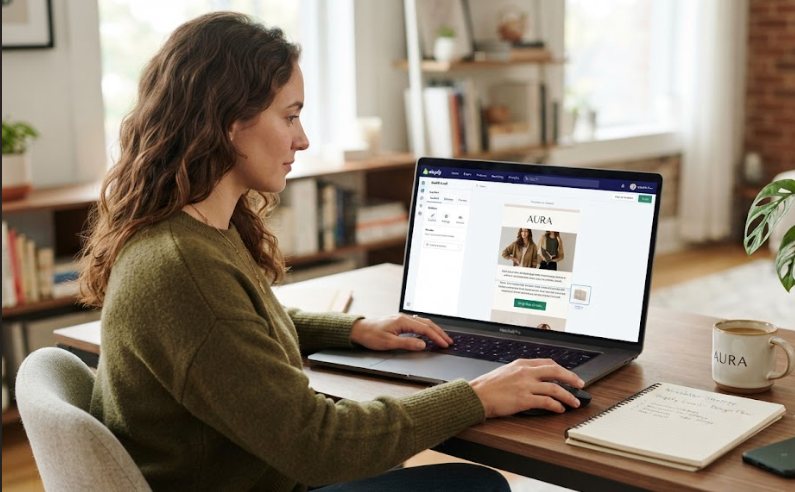
For a standard promotional email, use this five-block sequence:
- Recognition: A logo or unmistakable brand identifier.
- Lead: A short headline and one dominant image or product visual.
- Reason: Two or three lines explaining the product, offer, or benefit.
- Action: One prominent button with an accurate destination.
- Support: A small amount of secondary information, such as a deadline, product detail, or reassurance.
This order matters more than visual effects. A subscriber should understand the campaign quickly even when they scan only the top half of the email. That structure is a practical starting point for designing a newsletter using Shopify Email without turning a simple campaign into a crowded promotion.
Keep the headline specific. “New arrivals are here” is usable but vague. “Lightweight layers for humid-weather weekends” gives the reader a clearer reason to continue. The button should complete the sentence logically, such as “Shop the collection,” “See the new colors,” or “Build your routine.”
3. Match the Layout to the Type of Send
Not every newsletter needs the same ratio of copy, imagery, and products. A new-product announcement needs a different layout from an educational update or a repeat-purchase reminder.
| Newsletter Purpose | Design Emphasis | Main Destination |
|---|---|---|
| New collection or launch | One strong visual, concise headline, collection-level CTA | Collection page |
| Restock notice | Product image, availability detail, direct CTA | Product page |
| Educational send | Readable copy, helpful imagery, softer CTA | Blog post, guide, or category |
| Seasonal promotion | Clear offer, product relevance, visible deadline | Campaign landing page or collection |
| Repeat-purchase reminder | Product familiarity, timing, and convenience | Reorder path or product page |
Let the objective determine the layout, not the other way around. Reusing a launch template for every campaign makes the newsletter feel routine and can bury the point of the message.
4. Build It in Shopify Messaging Without Overbuilding It
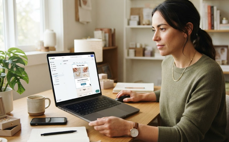
In Shopify’s current workflow, go to Apps > Messaging, choose Create campaign, select an email template, and then choose the subscriber group or customer segment for the send. Add the subject line, preview text, campaign content, and delivery timing before scheduling or sending.
For merchants learning how to design a newsletter using Shopify Email, the editor should be treated as a publishing tool, not a place to make every design decision from scratch. Decide the email’s structure and copy first, then use only the blocks that serve the campaign.
A reliable build sequence is:
- Select the recipient group.
- Choose the closest suitable template, not the most decorative one.
- Add the headline, lead image, concise copy, and one primary button.
- Check that buttons and product cards point to the exact destination.
- Preview the email on desktop and mobile before sending.
Avoid adding a section only because the template includes one. Empty space can make an offer easier to understand.
5. Make the Email Feel Like an Extension of the Store
Subscribers should recognize the sender before reading every line. Use the core colors, type choices, image direction, and voice that appear on the storefront. This helps the product page feel like a natural continuation of the email.
A well-defined Shopify website design system gives your team clearer rules to reuse across the storefront and email program. The goal is not to copy every page element into an inbox. It is to carry the cues that make the experience feel coherent.
Use one or two type styles rather than several decorative fonts. Reserve high-contrast color for the primary action. Avoid placing essential text inside images, and leave enough space around copy and buttons for easy reading and tapping.
6. Treat Mobile as the Main Design Review
Most subscribers will open the newsletter in a narrow email client window or on a phone. Check whether the headline still works without the supporting paragraph, whether the button remains visible without excessive scrolling, and whether product images still make sense at a smaller size.
A mobile-focused newsletter also limits competing links. A header menu, several product cards, social icons, and multiple buttons can send readers in too many directions. Keep the primary call to action visually distinct, then add secondary links only where they genuinely help.
Test the email as a shopper would. Open the campaign on a phone, tap the button, and inspect the page that opens. The experience should feel continuous from inbox to storefront.
7. Check the Click Path Before You Schedule
Good newsletter design continues after the inbox. The page behind the button should deliver exactly what the email promised.
Before scheduling, check the subject line and preview text, image crop, button copy, link destination, product availability, price, variants, and any offer timing. When the newsletter is intended to drive sales, the destination page matters as much as the email layout. Shopify CRO consulting can help merchants examine whether the route from email click to product discovery, cart, and checkout creates unnecessary friction.
After sending, review which links earned attention and whether readers reached the page you expected. Change one meaningful element in the next comparable campaign, such as the headline, lead image, CTA, or copy length. This makes future newsletter decisions more deliberate.
Conclusion: How to Design a Newsletter Using Shopify Email
The best answer to how to design a newsletter using Shopify Email is to begin with a focused campaign goal, then build a clear reading path with relevant imagery, restrained brand styling, and one primary action. Shopify’s email tools can help you assemble and send the campaign, but the strategy behind the email determines whether a subscriber understands what to do next.
For merchants who want their email campaigns and storefront experience to work together more effectively, Zissu Global combines Shopify design and conversion thinking to create clearer paths from campaign click to purchase.