A product page can look polished on a desktop computer yet become difficult to use on a smartphone. Images may occupy too much space, product options can be difficult to select, and important purchasing information may disappear beneath lengthy sections.
For Shopify merchants asking, “What is UI UX design for mobile?”, the answer goes beyond adapting a desktop website to a smaller screen. It involves designing shopping experiences around touch interactions, limited screen space, and customer purchasing needs.
Mobile UI/UX design focuses on how people interact with websites and applications through smartphones and other portable devices. For ecommerce businesses, its purpose is to make product discovery, comparison, and purchasing easier without sacrificing essential information.
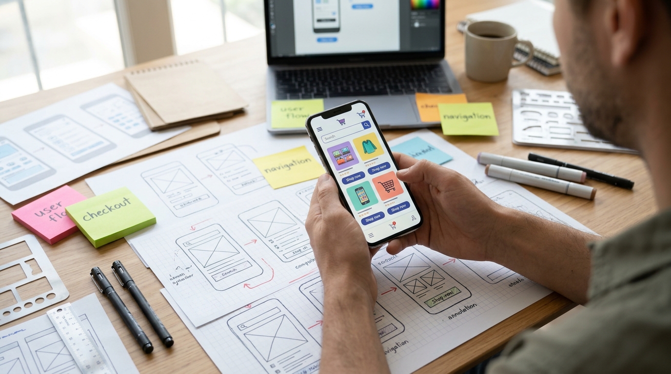
What Is UI UX Design for Mobile and How Does It Work?
Mobile UI/UX design combines two closely related disciplines: user interface (UI) design and user experience (UX) design.
Mobile UI design concerns the visible and interactive elements of a website, including buttons, menus, typography, product images, spacing, and form fields.
Mobile UX design focuses on how easily customers complete tasks, such as finding products, selecting variants, reviewing delivery information, and finishing a purchase.
Consider a Shopify clothing store.
Its UI determines how size selectors, product photographs, and add-to-cart buttons appear on a smartphone. Its UX determines whether shoppers can locate their size, understand the product, and add it to their carts without confusion.
Both influence usability, but attractive visuals alone cannot compensate for a confusing purchasing process.
Why Mobile Shopping Requires Different Design Decisions
Smartphones introduce constraints that desktop users rarely encounter.
Customers navigate through touch rather than a mouse, interact with smaller screens, and may shop while commuting or switching between applications.
These conditions influence what information should appear first and how customers move between pages.
| Design Element | Desktop Experience | Mobile Consideration |
|---|---|---|
| Navigation | Expanded menus | Compact, accessible navigation |
| Product images | Multiple visible thumbnails | Swipeable, responsive galleries |
| Buttons | Mouse interaction | Comfortable touch targets |
| Product information | Side-by-side sections | Clear vertical hierarchy |
| Forms | Larger typing area | Fewer fields and suitable keyboards |
The principles of responsive web design help websites adapt their layouts to different screen sizes.
However, responsive formatting alone does not guarantee good mobile usability. Merchants must also evaluate the shopping experience itself.
Five Mobile UI/UX Elements That Matter for Shopify Stores
Understanding what is UI UX design for mobile becomes more practical when examining the individual components customers use while shopping.
1. Navigation That Makes Products Easy to Find
Mobile menus should present product categories without overwhelming visitors.
A furniture retailer might organize collections by room, furniture type, and intended use rather than displaying every available category immediately.
Search, filtering, and sorting should remain accessible on smaller screens.
The goal is to help shoppers reach relevant products without navigating unnecessary pages.
2. Product Pages With a Clear Information Hierarchy
Mobile product pages have limited visible space.
Merchants should prioritize product identity, pricing, relevant images, available options, and purchasing controls.
Additional details, such as materials, specifications, shipping information, and return policies, should remain easy to locate.
Expandable sections can help organize longer descriptions, provided important information is not unnecessarily concealed.
A useful mobile layout gives shoppers the information they need at the point where they are making a decision.
3. Buttons and Forms Designed for Touch
Buttons that work with a mouse may be difficult to select accurately with a finger.
Mobile interfaces need sufficiently large touch targets, appropriate spacing, and clear visual feedback.
Forms should also minimize unnecessary typing.
For example, email fields can use email-optimized keyboards, while address forms can use supported autofill functionality.
These decisions reduce interaction difficulties without changing the store’s underlying products or prices.
4. Product Images That Support Purchasing Decisions
Mobile product imagery should remain readable and useful without requiring excessive zooming.
A cosmetics retailer may need close-up photographs showing packaging, colors, and product texture.
Shopify themes support responsive image layouts, but merchants should review how photographs appear at different screen sizes.
Images also need appropriate dimensions and compression to avoid unnecessary loading delays.
5. Checkout Experiences That Reduce Confusion
Customers should understand delivery charges, available payment options, and order totals before confirming their purchases.
Merchants should test checkout behavior on actual smartphones rather than relying entirely on desktop previews.
Some checkout features are controlled by Shopify and depend on the merchant’s plan and configuration.
Mobile UI/UX improvements should therefore focus on supported customization options and issues the business can realistically address.
How Shopify Merchants Can Evaluate Mobile Usability
Businesses researching what is UI UX design for mobile should review how customers actually interact with their storefronts.
Start with the most commercially important journeys: opening a collection, selecting a product, choosing variants, adding an item to the cart, and completing checkout.
Test these journeys on different mobile devices and screen sizes.
Pay attention to unclear labels, difficult interactions, unexpected layout shifts, and information that requires excessive scrolling.
Shopify’s theme editor includes a mobile preview, while its official Theme Store themes are responsive. Nevertheless, a preview cannot replace practical usability testing.
Merchants can use mobile conversion data, customer feedback, and privacy-compliant session recordings to identify navigation difficulties, confusing product options, and checkout problems.
Businesses planning wider improvements may benefit from professional Shopify brand design services that address mobile layouts, navigation, and storefront usability.
Does Better Mobile UI/UX Increase Conversion Rates?
Improved mobile usability can remove obstacles that prevent customers from purchasing, but design changes do not guarantee higher conversion rates.
A redesigned product page might make variant selection easier, while a clearer cart could reduce uncertainty about shipping costs.
Merchants should measure these changes using appropriate indicators, including mobile purchase conversion rate, cart additions, checkout completion, and customer feedback.
Google’s Core Web Vitals can also help assess loading performance, responsiveness, and visual stability.
When evaluating what is UI UX design for mobile, businesses should consider usability and technical performance together rather than treating design as a purely visual exercise.
Conclusion
Mobile interface design influences how comfortably customers browse, evaluate products, and complete purchases on smaller screens.
Clear navigation, readable product information, accessible controls, and reliable checkout functionality can make Shopify stores easier to use.
Regular testing helps merchants identify problems before they affect larger numbers of customers.
Zissu Global supports ecommerce brands with Shopify storefront design, responsive layouts, and user experience improvements aligned with business requirements.